What you get on the chart
Three things, and nothing you have to decode.
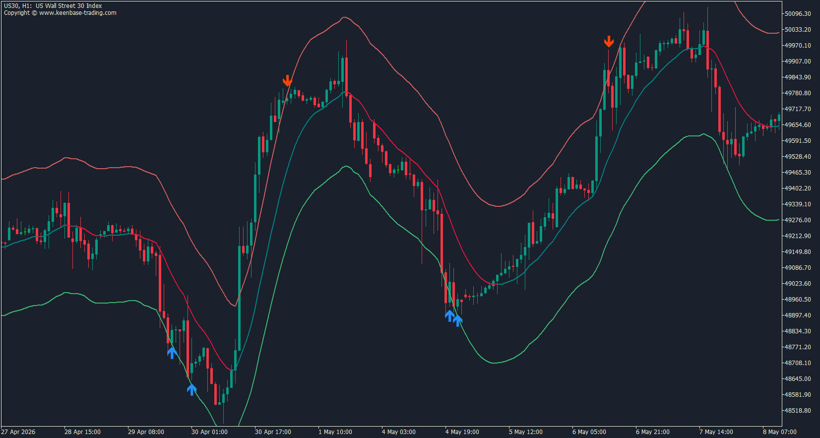
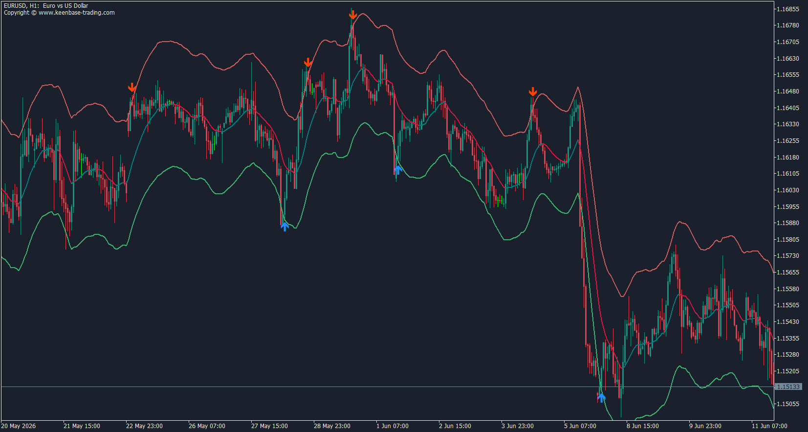
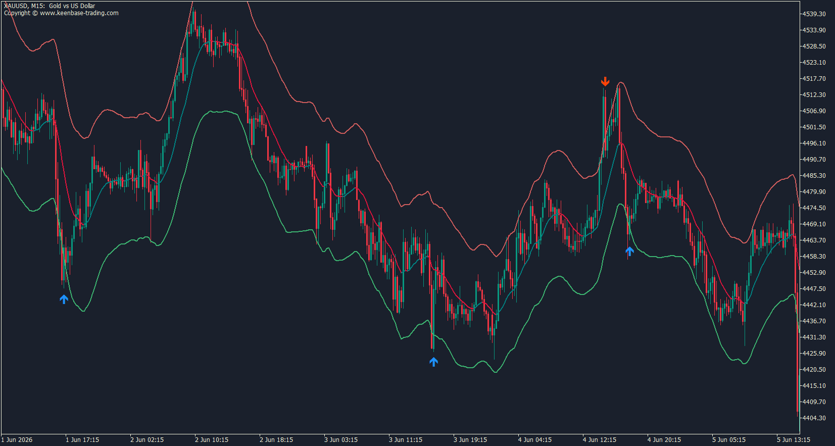
The centerline: A smooth curve running through the middle of price action, coloured by its own direction. Teal while it climbs, crimson while it falls, grey when it flattens out. Watch the colour flip, and you have a read on whether the market is still pushing or losing interest.
The envelopes: An upper and a lower band that widen when price starts travelling further from the centerline and tighten when it settles down. They are not fixed percentages. On a quiet London session, the channel narrows around price.
When New York opens, and the range expands, the bands expand with it, so a touch means the same thing in both conditions.
The reversal arrows: A blue arrow below the candle when price closes back above the lower band after closing beneath it. An orange arrow above the candle when price closes back inside from above the upper band. The arrow marks the moment the stretch gave up, not the moment it started.
That last distinction is the one traders miss. Plenty of tools flag the candle that pierces the band. Piercing a band tells you price went far.
It does not tell you price is coming back. The arrow here waits for price to come back inside on a completed candle, which costs you a bar of entry but skips most of the trades where price keeps running.
Why non-repainting matters with this indicator
Kernel regression has a specific weakness, and understanding it explains why most versions of this tool look better in review than they perform in the market.
The standard approach estimates the smoothed value at any given candle using the candles on both sides of it. Bars from the future get a vote. That produces a beautiful curve when you look at history, because the curve was drawn with information that did not exist at the time.
Every new candle that arrives changes the vote, and the curve behind it shifts. Signals appear on old bars. Signals that were there yesterday are gone this morning. You backtest it, the numbers look excellent, and none of it survives contact with a live account.
This indicator never looks forward. Each value on the centerline uses that candle and older candles, full stop. The curve you see on a bar from three weeks ago is the curve that was on your screen three weeks ago.
Arrows follow the same rule. The forming candle is locked out of generating a signal. The indicator evaluates a bar only once that bar has closed, and the arrow appears on it as the next candle opens.
Once an arrow is confirmed, it does not move, disappear, or get recalculated during normal operation. Alerts fire on the same schedule, so what your phone tells you matches what your chart shows.
Two honest caveats, because you should hear them from us rather than find out later.
The centerline and the bands on the candle currently forming will move as that candle's price moves. Any indicator reading live price does this. The bands are what stay fixed, and the arrows are what you trade.
Changing Smoothness or Band Width recalculates the entire history based on the new settings, so older arrows may differ. That is the settings changing, not the indicator rewriting itself. Pick your configuration, then leave it alone and judge it forward.
Three ways to trade the Nadaraya-Watson envelope
Nothing here is a system. These are the three patterns traders actually use with a band tool like this, and the indicator supports all three without changing anything but one checkbox.
Fading the extremes
Leave the trend filter off. You are trading the snap-back.
Price closes outside a band, then closes back inside, and the arrow prints. You enter on that close. Your first target is the centerline, which is where the stretch usually unwinds to before the market makes its next decision. Stop goes beyond the extreme of the candle that pushed furthest outside the band.
This works best on instruments that range more than they trend, and on sessions where nobody is pushing. Asian range on the majors. Mid-afternoon on an index that has already made its move. It punishes you during a strong directional day, which is exactly what the next approach is for.
Trading pullbacks with the trend filter on
Switch Use Trend Filter to true and the character of the tool changes completely.
Now a blue arrow only prints when the centerline is climbing, and an orange arrow only prints when it is falling. A blue arrow with a rising centerline means price dipped below the lower band inside an uptrend and recovered.
That is a pullback that failed to become a reversal, which is one of the better continuation entries available.
You get fewer signals. The ones you get pull in the same direction as the smoothed trend rather than against it. Most traders who stay with this indicator long term end up here.
Using the centerline for bias only
Turn the arrows off and treat the indicator as context for whatever you already trade.
Centerline teal and price holding above it, you look for longs and ignore shorts. Price sitting hard against the upper band, you stop chasing the breakout and wait. Centerline flat and grey with price oscillating between the bands, you are in a range, and you size accordingly.
Some traders run it on the higher timeframe purely for this and take their entries elsewhere.
One thing the indicator will not do for you
There are no take profit lines, no stop levels, and no position sizing. It marks where price stretched and where it came back. Where you get out, and how much you risk getting there, stays your job.
Nadaraya-Watson envelope settings
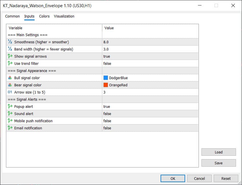
Two inputs change the behaviour. The rest are cosmetic.
Smoothness
Default: 8.0
This controls how tightly the centerline tracks price.
Raise it, and the curve flattens out, ignoring short swings and holding its colour through noise. You get a cleaner read on direction and slower turns. Drop it, and the centerline starts following individual swings, changing colour more often and reacting to moves the higher setting would have absorbed.
The bands follow the centerline, so this affects your signals too. A flatter centerline means price wanders further from it, which spreads the bands and reduces how often price gets outside them.
Start at 8.0. If the centerline changes colour so often that you cannot read a trend from it, raise it. If it stays teal through an obvious selloff, lower it.
Band Width
Default: 3.0
This is your signal frequency dial, and it is the one worth spending time on.
Higher values push the bands further from the centerline. Price has to travel further before it gets outside, so you get fewer arrows, and each one marks a genuine stretch. Lower values pull the bands in tight. More arrows, more of them marking ordinary pullbacks rather than exhaustion.
There is no correct number. Gold on M15 and EURUSD on H4 do not stretch the same way. Set it, scroll back through a few hundred candles, and count. If you are seeing arrows on most swings, raise it. If you go a week without one, lower it.
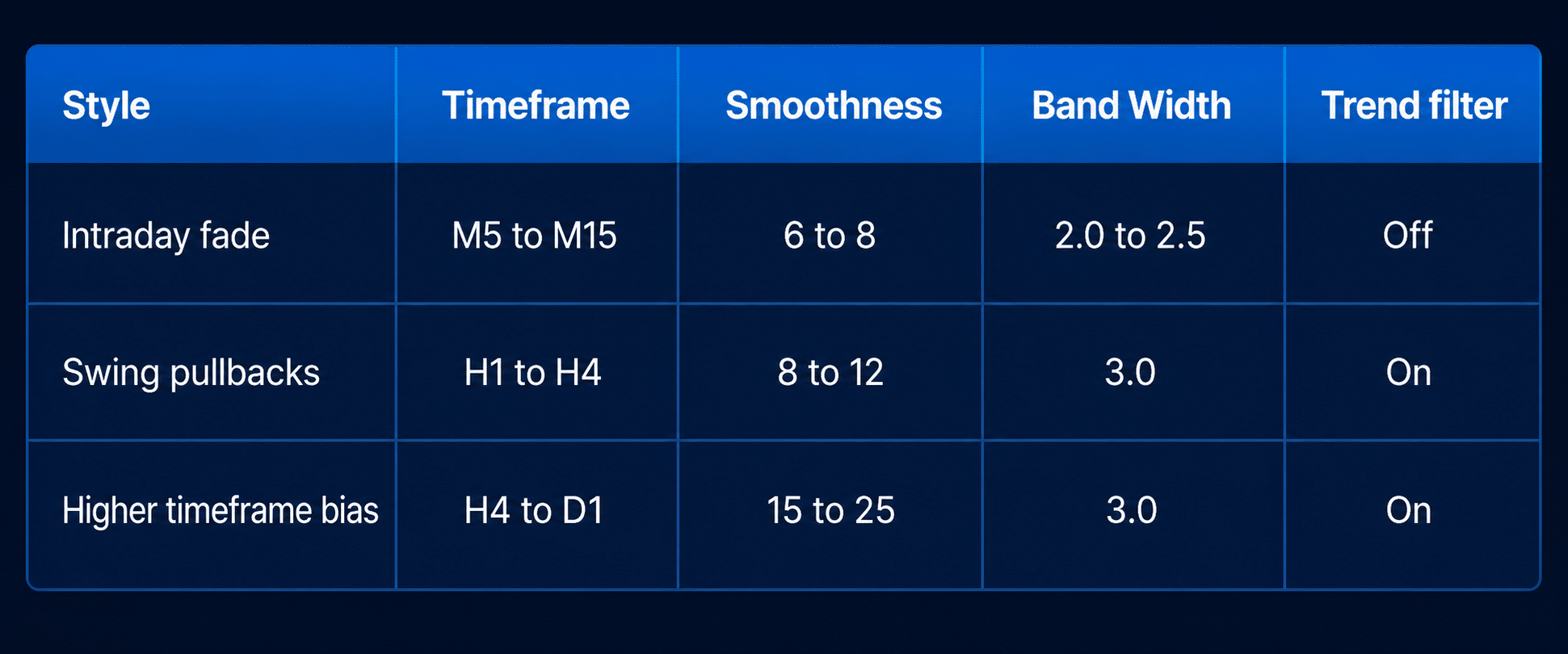
Starting points
These are places to begin, not tested configurations. Adjust from here based on how many signals your instrument actually produces.
The rest of the inputs:
Show Signal Arrows hides the arrows while leaving alerts running, for traders who want a clean chart and a notification.
Bull and Bear Signal Colour and Arrow Size are appearance only. Arrow size runs from 1 to 5.
Give the chart a few hundred bars of loaded history before the indicator has enough to work with. Scroll back once after attaching, and the terminal fills it in.
Alerts on confirmed signals
Four channels, each switched on or off on its own.
Popup puts a window on your terminal. Sound plays through MT4 or MT5. Mobile push sends to your phone, which needs your MetaQuotes ID entered in the terminal first. Email goes out through the terminal's mail settings, so those have to be configured before it will send.
Every alert carries the symbol, the timeframe, the direction, and the closing price of the candle that triggered it. Enough to act on without opening the chart.
The timing matters more than the channels. An alert fires once, when the signal candle has closed, and the next one opens. You will never get an alert on a maybe. You will never get one that later turns out not to have happened.
What this indicator does not do
Worth saying plainly, because the free indicator space is full of pages that imply more than they deliver.
It does not place trades, manage positions, or work as an Expert Advisor. There are no take-profit or stop loss lines, no pip counters, no floating profit labels, no shaded zones between price and the bands.
It does not signal on an unfinished candle, and it will not tell you a reversal is coming before the market has confirmed one. It draws no centred or forward-looking version of the curve, which is the whole point.
It will not make you money on its own. It marks where price stretched and where it came back, on a chart that does not lie about its own history. What you do with that is the part that decides the outcome.
Frequently asked questions
Does the Nadaraya-Watson envelope indicator repaint?
The signal arrows do not. A candle is evaluated only after it closes, and once an arrow prints, it stays on that candle. The centerline and bands on the candle currently forming will move as its price moves, which is true of any indicator reading live price.
Changing Smoothness or Band Width recalculates history against the new settings, and that is the settings changing rather than the indicator rewriting itself.
What is the Nadaraya-Watson envelope?
It is a channel built around a kernel-regression estimate of price rather than a moving average. The centerline weights recent candles more heavily than older ones, which gives a smoother curve that turns faster than a moving average of similar length.
The upper and lower envelopes sit around it at a distance that adapts to how far price has been travelling from the curve recently.
Does this work on both MT4 and MT5?
Yes. Both versions are included in the download and behave the same way.
How is this different from Bollinger Bands?
Bollinger Bands centre on a simple moving average, which gives every candle in its window the same weight and lags accordingly. This centerline weights recent price more heavily and produces a curve that bends with the market instead of trailing behind it.
The signal logic also differs. Bollinger Bands mark the touch. This indicator marks the return on a closed candle.
Which pairs and timeframes work best?
It runs on any symbol and any timeframe with enough loaded history. Fading extremes suits ranging instruments and quiet sessions on lower timeframes. The trend filter version suits H1 and above.
Currency pairs, gold, indices, and crypto all work, though you will want to adjust Band Width per instrument since they do not stretch the same way.
What are the best settings?
Smoothness 8.0 and Band Width 3.0 are the starting point. Bandwidth is the one to tune. Scroll back through several hundred candles and count your arrows. Too many means raise it, too few means lower it, and the right number differs per symbol and timeframe.
Can I use the signals in an Expert Advisor or a scanner?
The centerline, both envelopes, and both signals are exposed for external use, so an EA or a multi-symbol dashboard can read confirmed signals directly. If you want something built around it, our custom MQL development service handles that work.
Is it actually free?
Yes. Enter your email and the download is yours- both platforms, no trial period and no locked features.